UP SourceHub is the central procurement marketplace for Union Pacific. It is a fully integrated procure-to-pay system for services and facilitates bidding and contracting for materials.
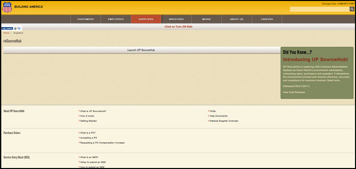
The reSourceHub is a repository of documentation including help links, FAQs, and standard work. It is found at http://www.up.com/suppliers/cas/index.htm and is the starting point to launch the UP SourceHub application.
The Launchpad is the home page for UP SourceHub. It is composed of “tiles” grouped by functionality type.
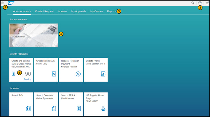
Click the Home Icon from anywhere in the application to return to the Launchpad.
Click the Help Icon to launch the help documentation specific to the tile you are in.
The Group headers organize tiles with similar functionality. Click a Group to jump to that section on the launchpad.
The Announcement tile displays important information such as outages to the system.
The Tiles show the applications or functions that you are authorized to access. You will only see the tiles which you have access to.
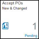
Each tile is a mini application or function within UP SourceHub. Some tiles show a number pending, indicating you have items awaiting action in your queue. Click a tile to begin work in that area.
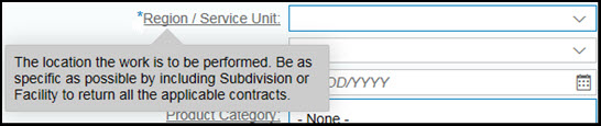
Within an application, a required field is indicated by a blue asterisk (*). Underlined labels indicate help text is available. Hover over or click on the label to display the help text.
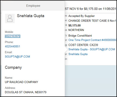
Click blue text to display more details in a pop-up or on a separate page.
Click
the Value Help Icon
 in a field
to open a dialog
box and search for the value you are looking for.
in a field
to open a dialog
box and search for the value you are looking for.
Filter
lists of information using the Filter
icon . It opens a dialog
box with various data elements to filter on. Some common data elements
are Status, Date, Product Category, and Location.
. It opens a dialog
box with various data elements to filter on. Some common data elements
are Status, Date, Product Category, and Location.
Click
the Sort Icon to
open a dialog box with sort options such as Ascending, Descending and
by relevant data elements.
to
open a dialog box with sort options such as Ascending, Descending and
by relevant data elements.
Click a section in a Scrolling Header to jump to the corresponding section.
Example 1:

Example 2:

The
Next
 and Previous
 arrows take you
to the respective item when there are multiple items on a document.
arrows take you
to the respective item when there are multiple items on a document.
The type of device or the screen resolution on the device may affect the application display.
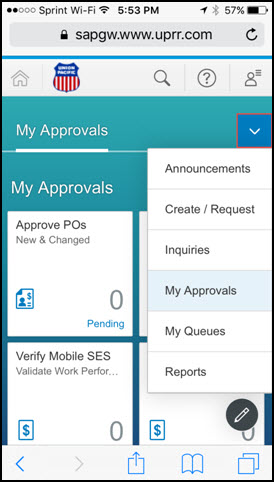
The menu bar may collapse. To see additional menu bar options, click the down arrow.
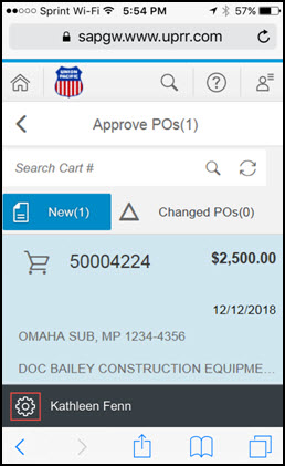
The left pane may display. Select an item in the list to see the detail. Buttons normally seen on the right pane may be seen on the left pane such as the Gear icon shown below.
The right pane may display with no data or the details of the first item in the list. To see the left pane/list of items, click the List icon.
Last Revised: March 19,2018